CASE STUDY
Daily Crunch
A Packaging Refresh That Sharpened Messaging, Elevated Shelf Presence, And Reinforced #1 Category Positioning At Erewhon
Packaging Design, Brand System Refinement, Messaging + Hierarchy
Services
Stronger Shelf Presence, Clearer Buyer Conversations, Continued #1 Category Positioning At Erewhon
Outcome
Packaging system refresh across the full SKU lineup, evolving from cluttered messaging to a simplified, scalable design system
Scope
Match the packaging to the brand's momentum and position Daily Crunch as the national-caliber brand it was becoming
Goal
Health-conscious snack shoppers looking for clean-ingredient, sprouted nut options at premium and natural grocers
Audience
#1
Selling Nut Brand By Units Sold At Erewhon, Week After Week For Months
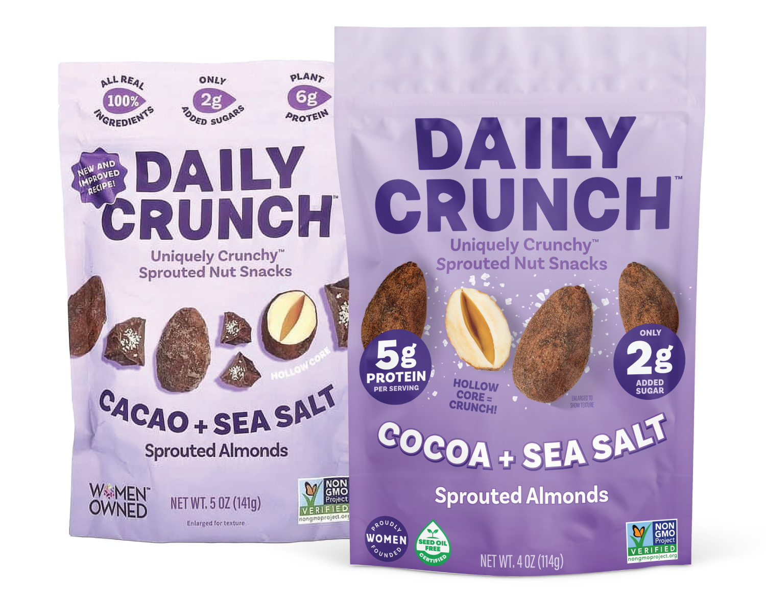
AFTER
BEFORE
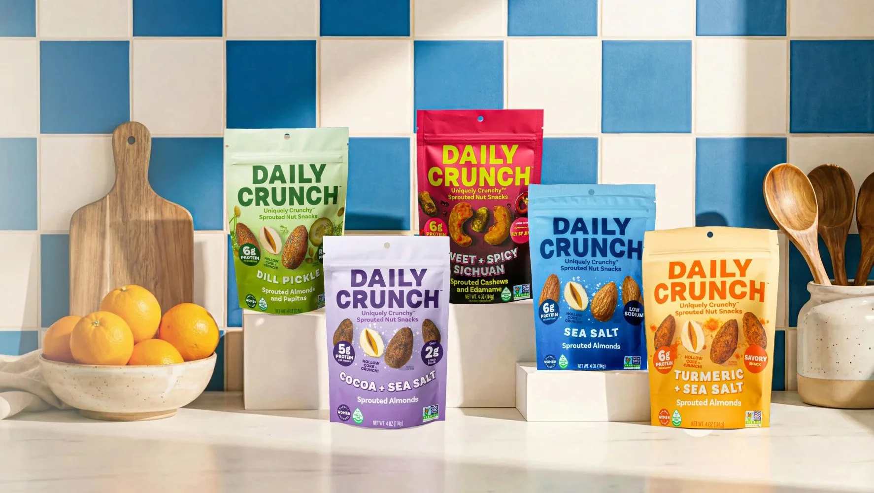
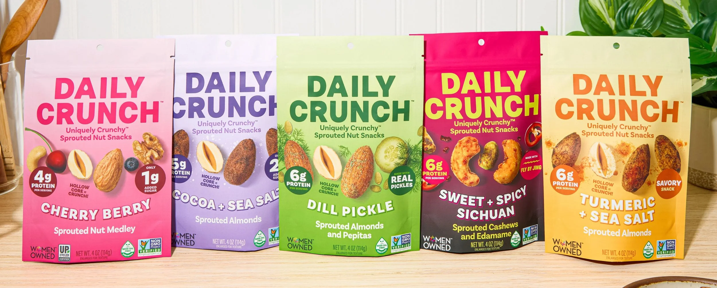
Daily Crunch Had Serious Momentum — #1 In Their Category At Erewhon, Growing Distribution, And A Loyal Following — But The Packaging Hadn't Kept Pace. In A Competitive Snack Aisle, The Brand Needed To Look As Strong As It Performed.
THE STARTING POINT
Daily Crunch had built something real. The product was winning on merit — earning the #1 nut brand position at Erewhon by units sold, week after week for months. But the packaging wasn't communicating with enough clarity or confidence where it mattered most: on shelf, in buyer conversations, and across a growing SKU lineup. The brand had outgrown its look, and the gap between product quality and shelf presentation was becoming a growth limiter.
THE CHALLENGE
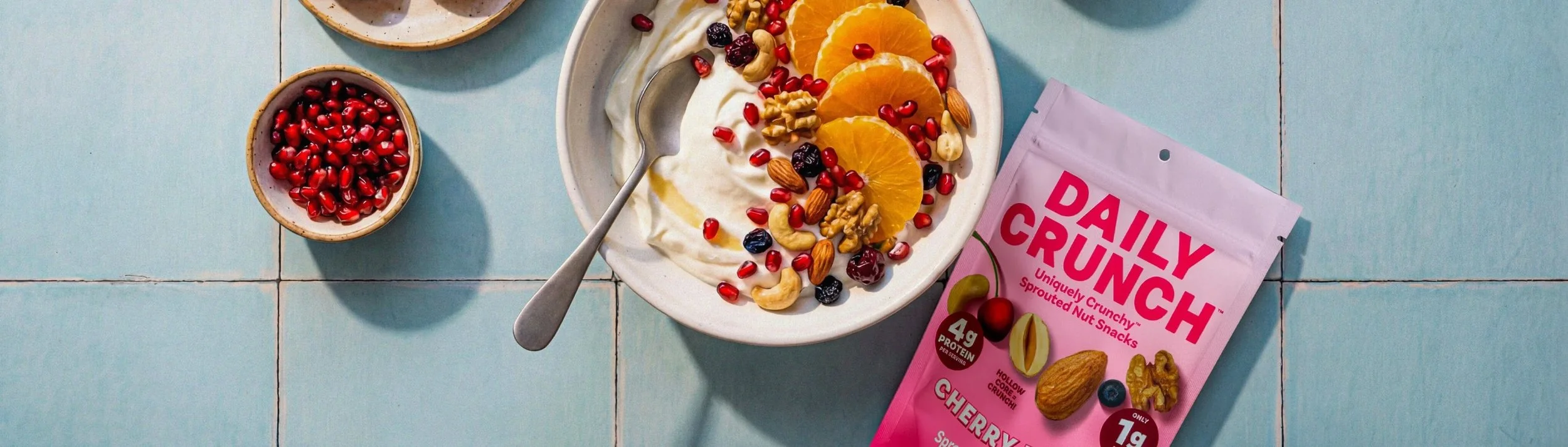
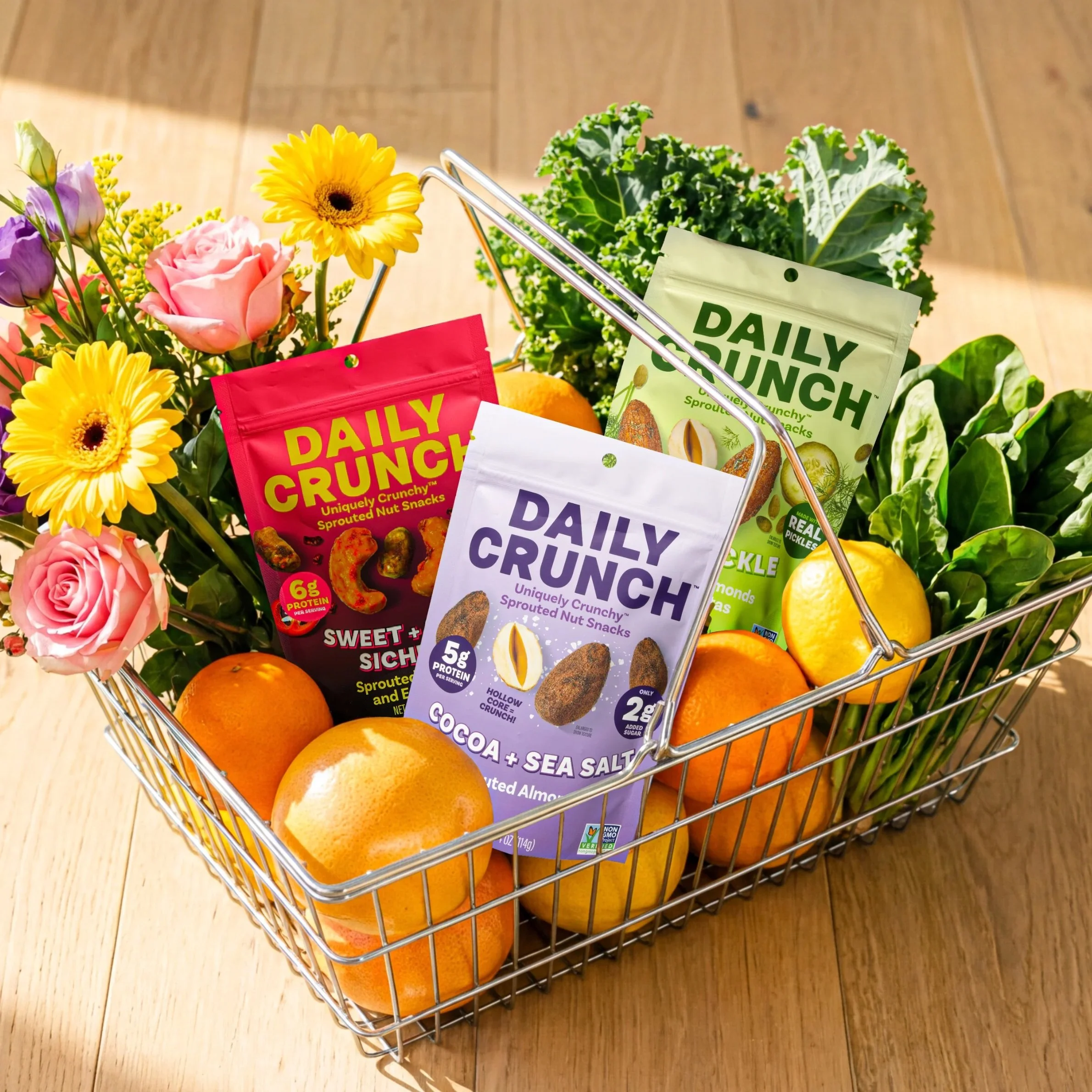
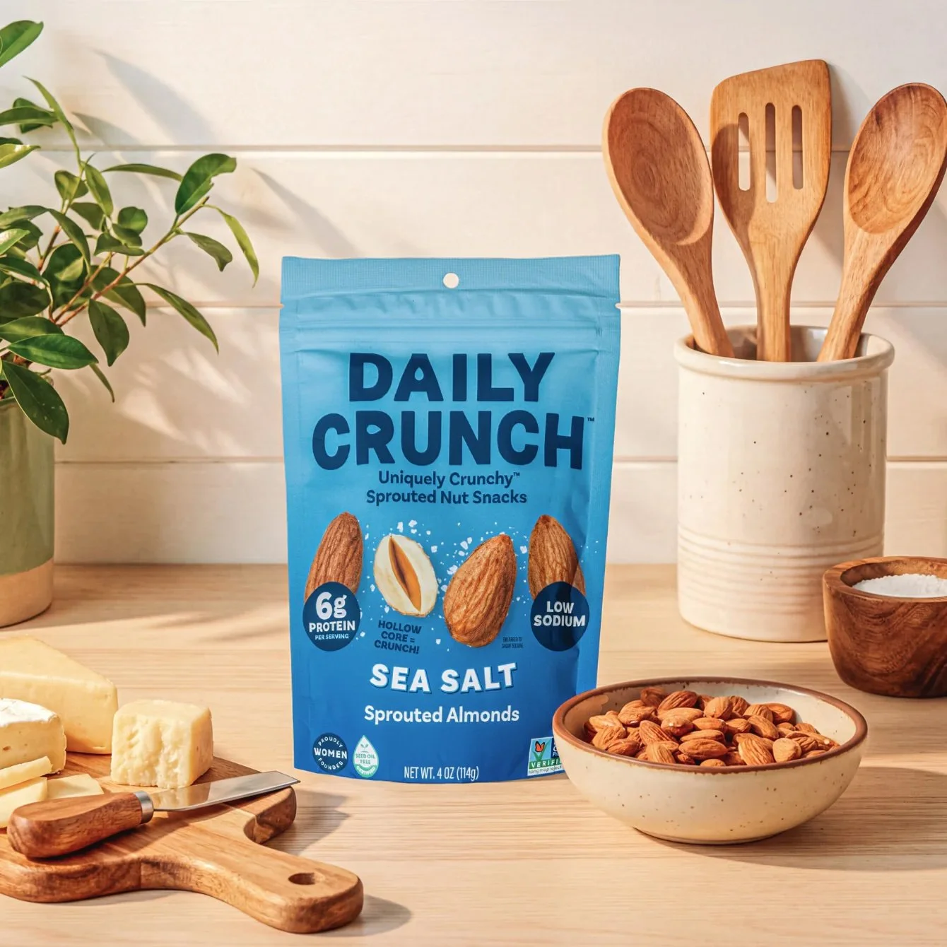
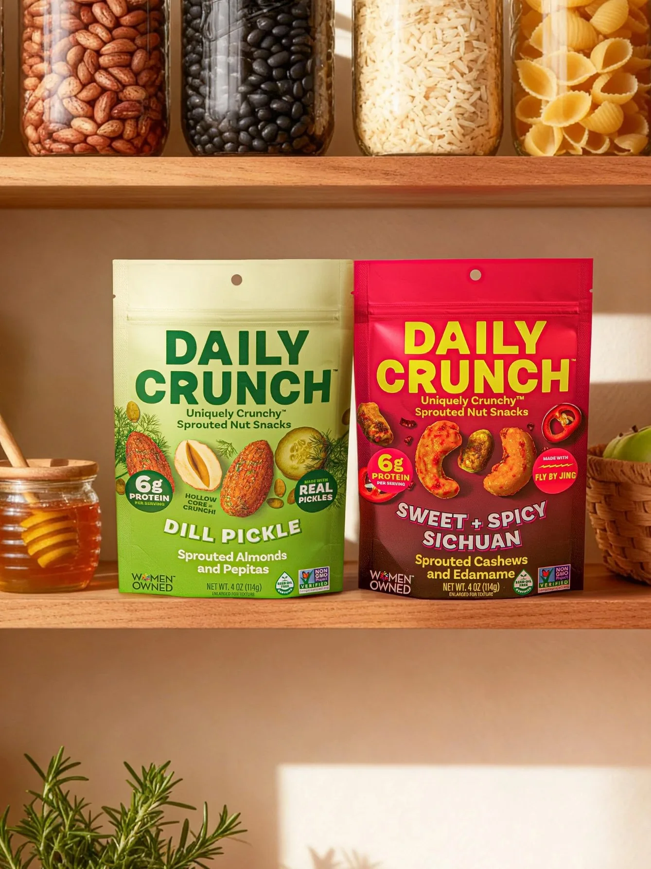
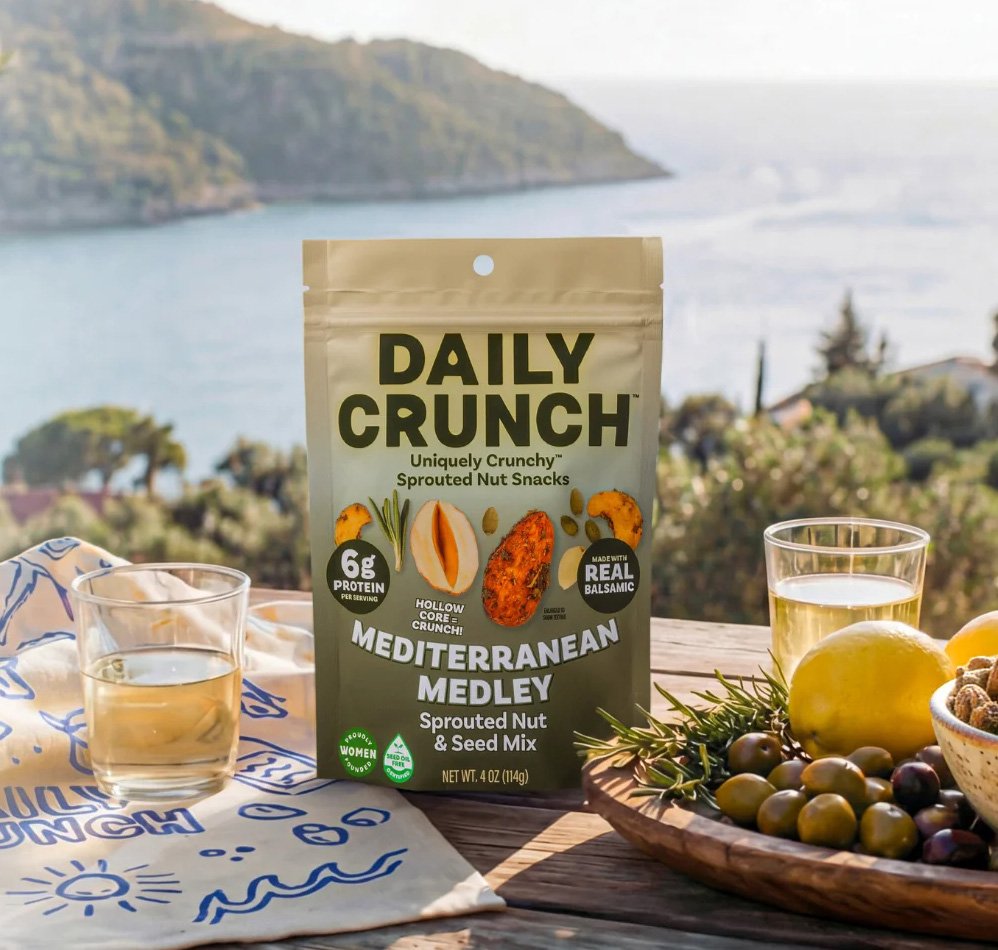
We built the refresh around one principle: less is more. We simplified the visual hierarchy, replaced illustrated imagery with real product photography, reduced callout icons from several to just two, and gave the logo more presence on pack. The Seed Oil Free Alliance certification moved to the front panel. Richer, deeper color gradients strengthened shelf interruption across the lineup. Every decision was made to help Daily Crunch read faster on shelf and scale easier as new flavors — like Cherry Berry — rolled out.
OUR APPROACH