CASE STUDY
Eureka Tortilla
A packaging refresh that clarified differentiation, elevated credibility, and delivered 25%+ Increase in Sales & Repeat Purchase
Identity Design, Packaging Design, Messaging + Hierarchy, Retail Readiness
Services
Stronger shelf presence, positive buyer feedback, 25%+ Lift in Velocity & Repeat Orders
Outcome
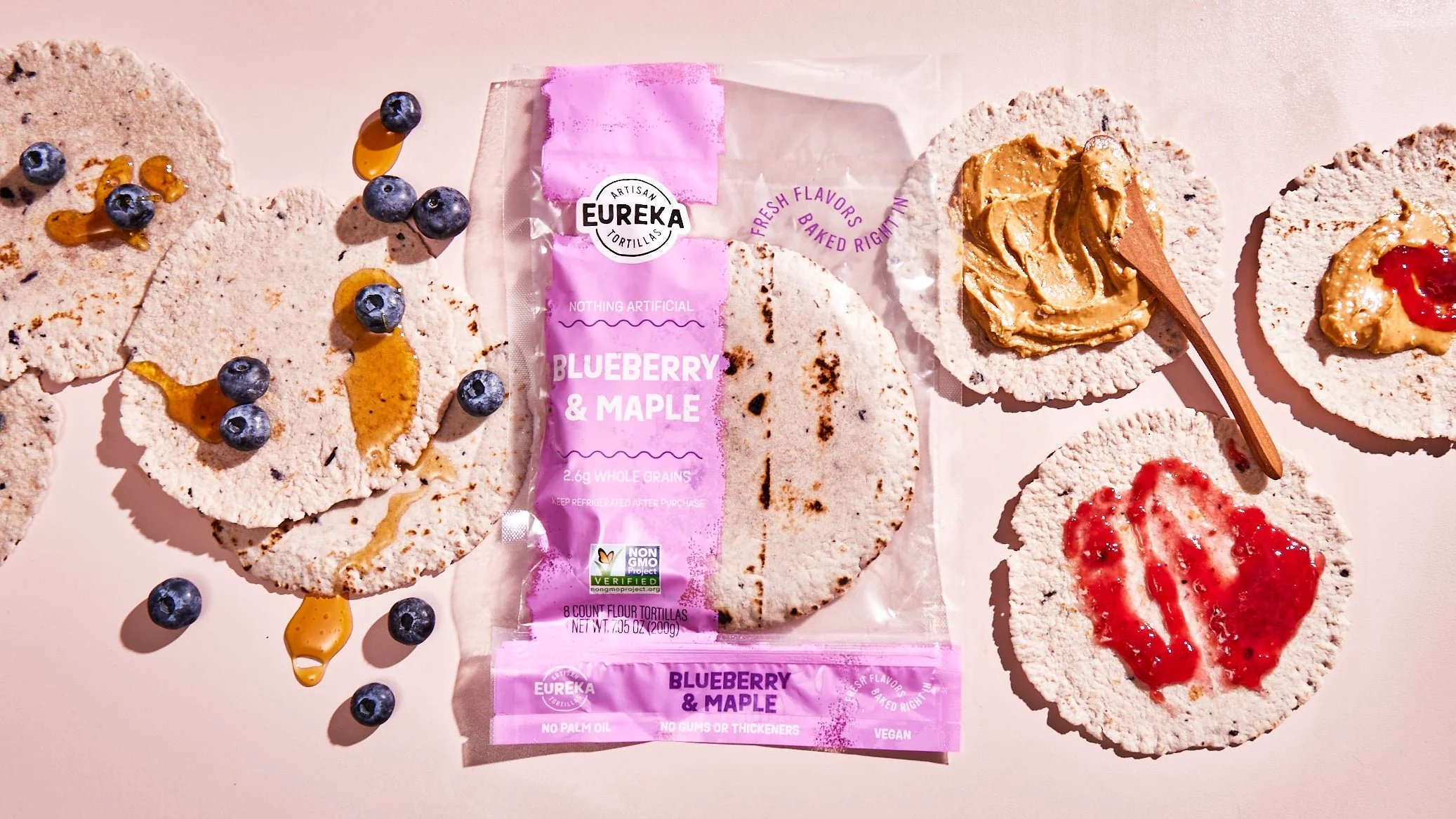
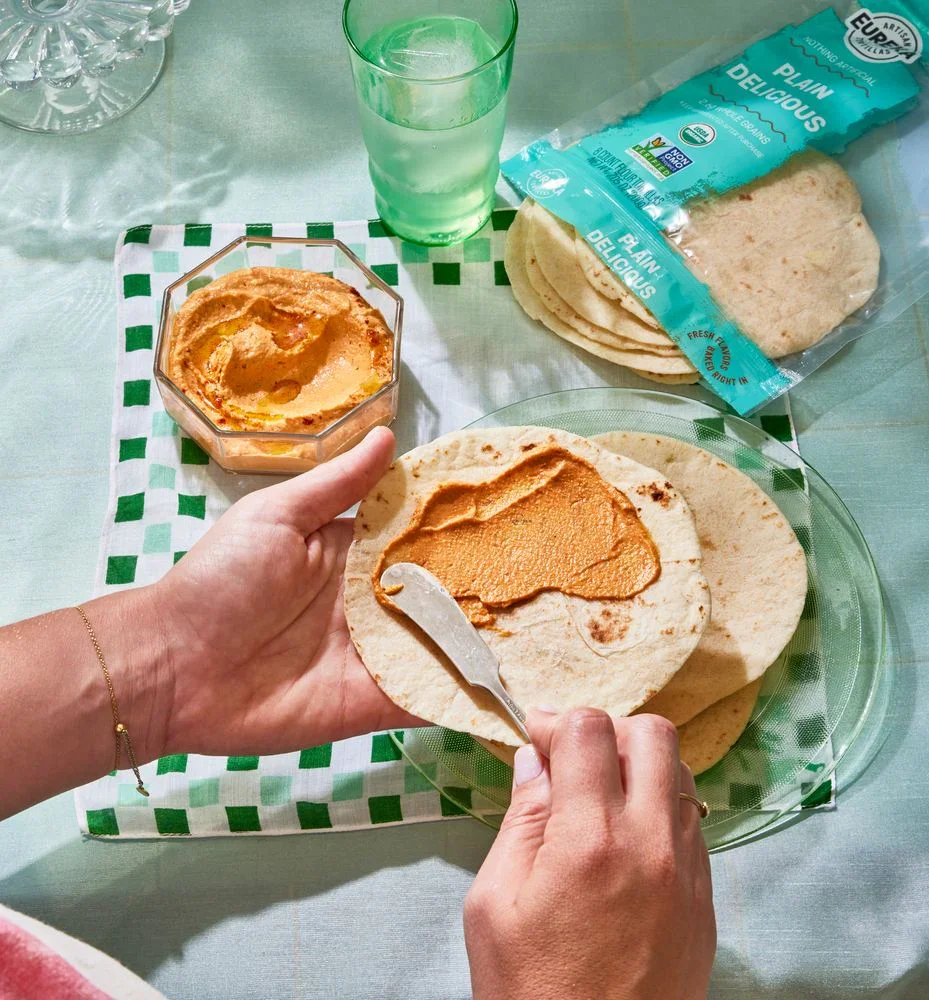
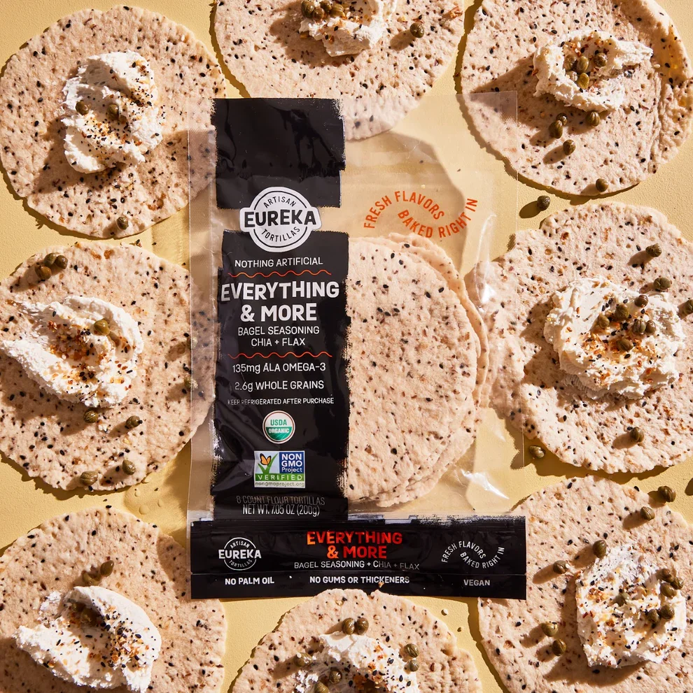
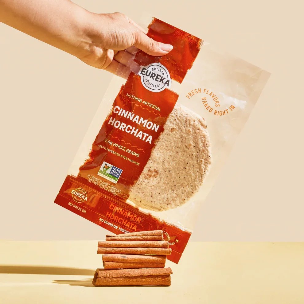
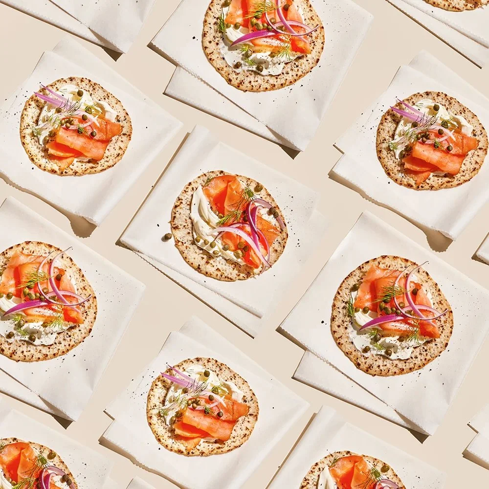
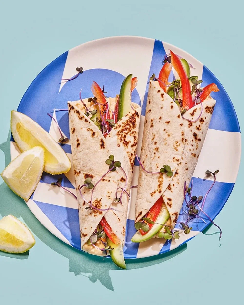
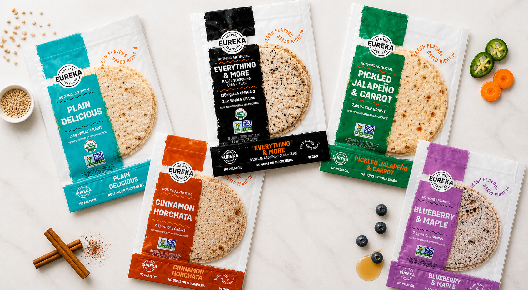
Brand identity and full packaging system redesign — evolving from a basic label on a clear bag to a retail-ready brand presence
Scope
Look established on shelf, stand out in a crowded set, and clearly communicate product differentiation
Goal
Audience
Retail buyers and shoppers who need to immediately understand why this brand matters
25%
improvement in velocity, reorders, and engagement after relaunch
AFTER
BEFORE
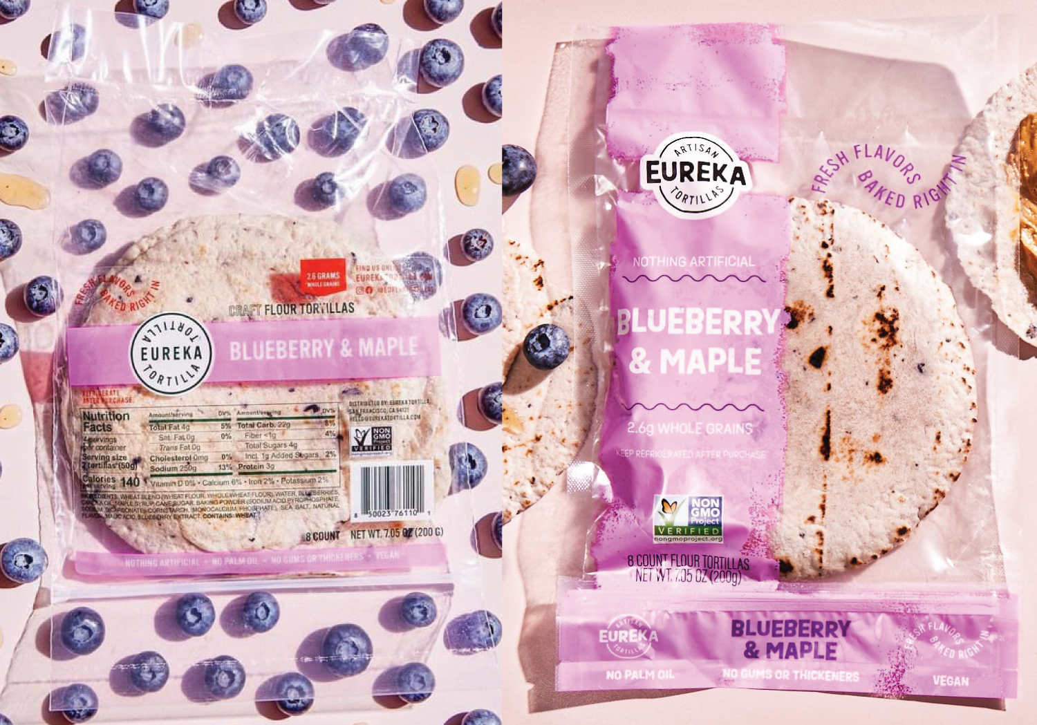
The brand's early branding and packaging — a simple label on a clear bag — may have been fast to launch, but it didn't signal credibility or highlight differentiation. In a crowded set, it blended in when it needed to interrupt.
THE STARTING POINT
The product had something worth noticing, but the branding and packaging weren't communicating it. The result was a shelf experience that felt underdeveloped and a brand impression that didn't match the quality inside the bag. The original packaging looked amateur and didn't showcase product differentiation — exactly the kind of friction that makes it harder for shoppers and buyers to immediately understand why this brand matters.
THE CHALLENGE
We developed new branding and packaging designed to do three things immediately: look established, so the brand shows up with confidence and credibility; stand out on shelf, through stronger hierarchy and more distinctive visual presence; and clarify differentiation, making the "why buy" obvious at a glance. This was a packaging-led transformation — elevating perception and sharpening communication without losing the simplicity that helped the brand launch quickly.
OUR APPROACH
“The packaging we originally launched with before working with Buttermilk was a basic label on a clear plastic bag, which looked very amateur and did not showcase our product differentiation. The Buttermilk team developed new packaging which made us look much more established and made us stand out more… exactly what we needed!”