Poptime Snacks
CASE STUDY
A Brand and Packaging Refresh That Clarified Differentiation, Strengthened Shelf Presence, And Fueled E-commerce Growth
Packaging Design, Brand System Refinement, Messaging + Hierarchy, Retail Readiness
Services
Stronger Shelf Presence, Clearer Buyer Conversations, Positive Retailer Feedback, Increased E-commerce Traction
Outcome
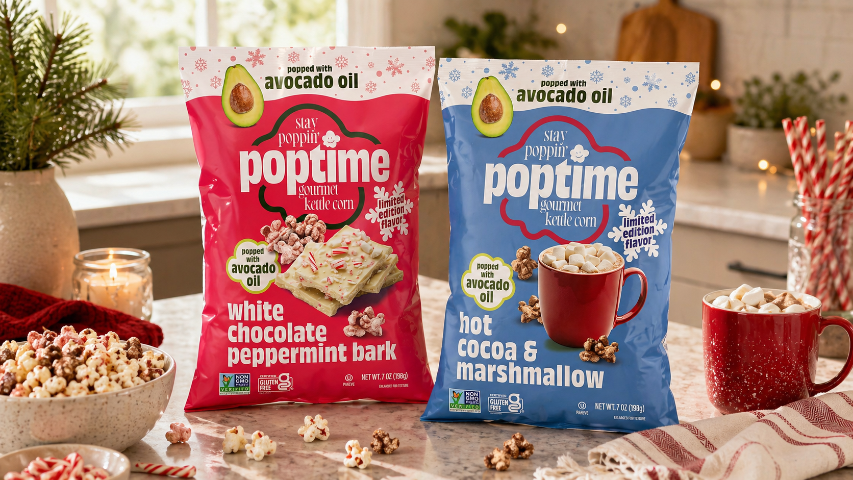
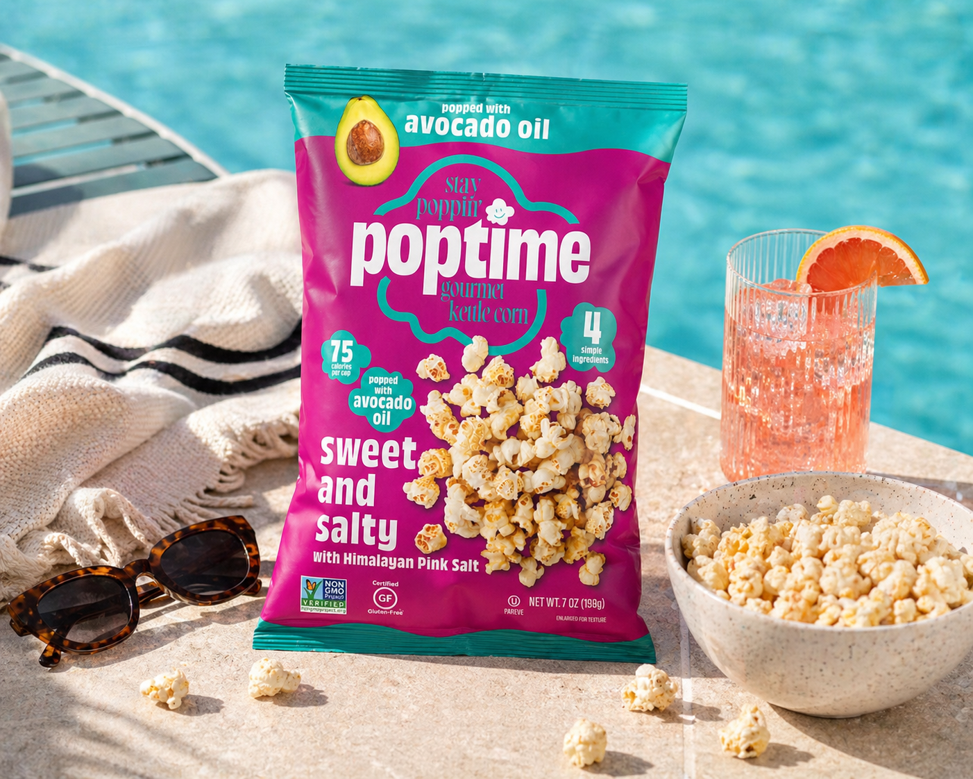
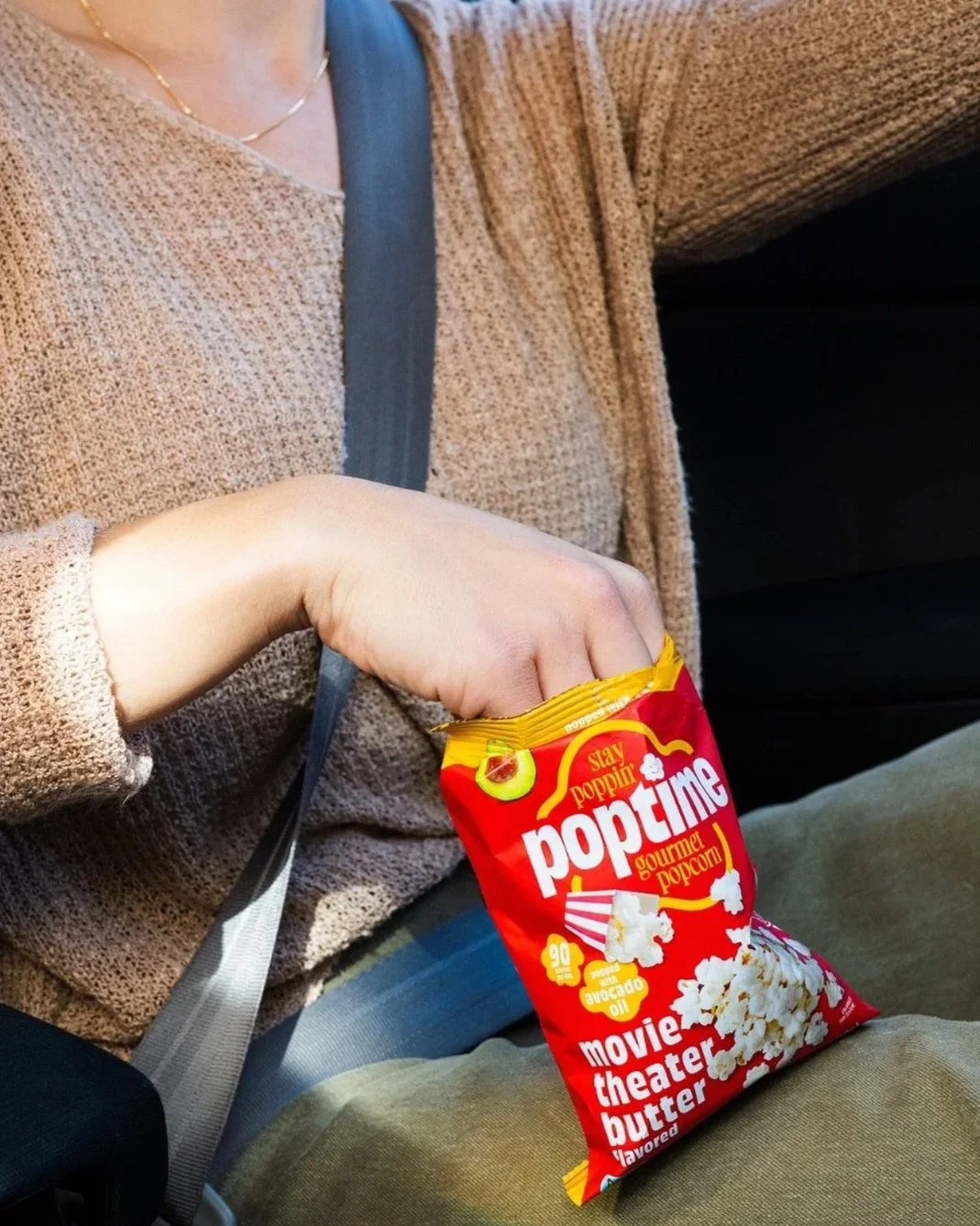
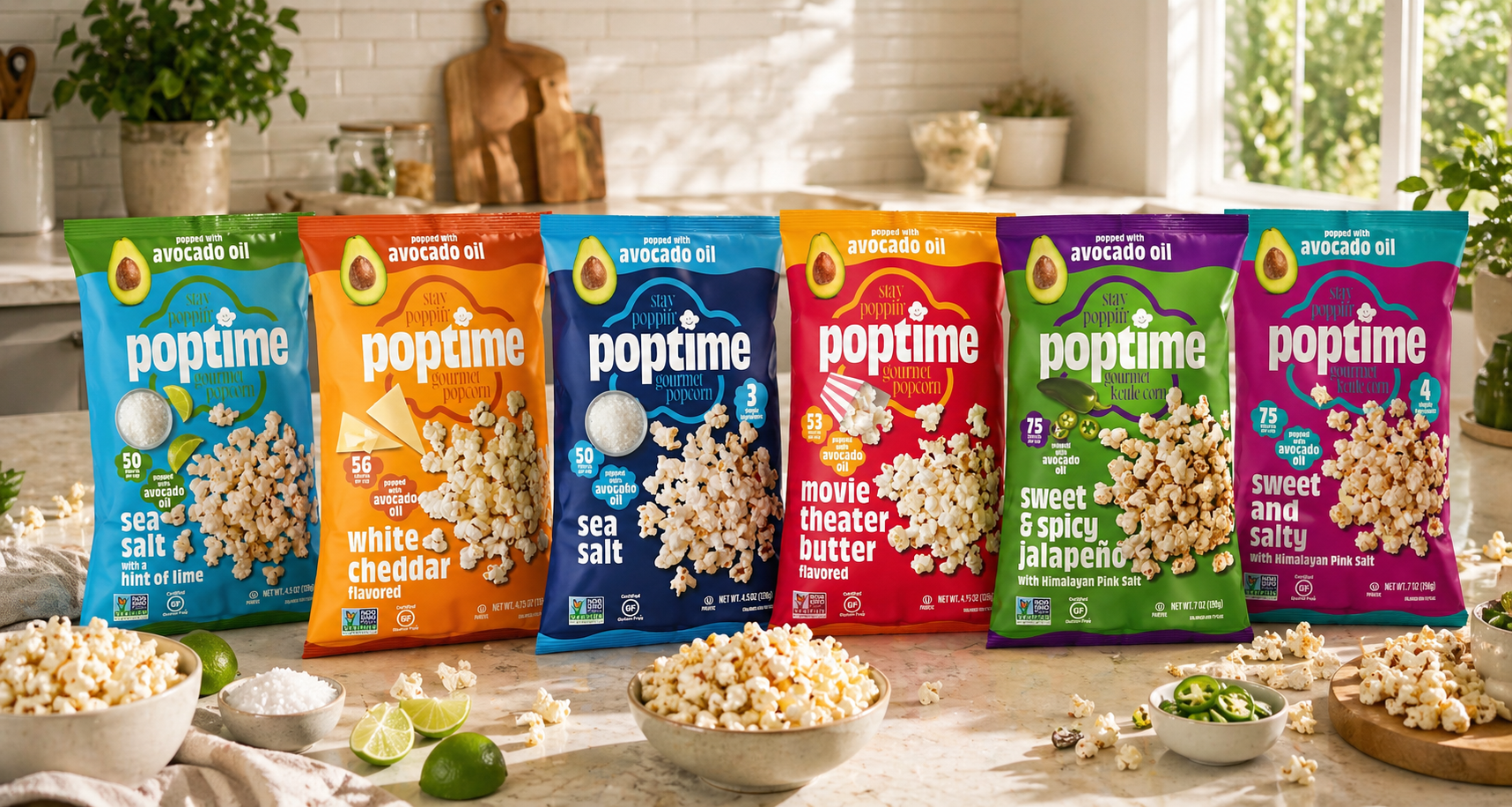
Packaging redesign and brand system refinement — evolving an outgrown look into a retail-ready, scalable brand presence
Scope
Show up as retail-ready, stand out in a crowded snack aisle, and clearly communicate a unique seed oil–free positioning
Goal
Retail buyers and shoppers who need to quickly understand what makes this snack different and worth choosing
Audience
E-commerce
Growth
& Stronger Retail Performance After Relaunch
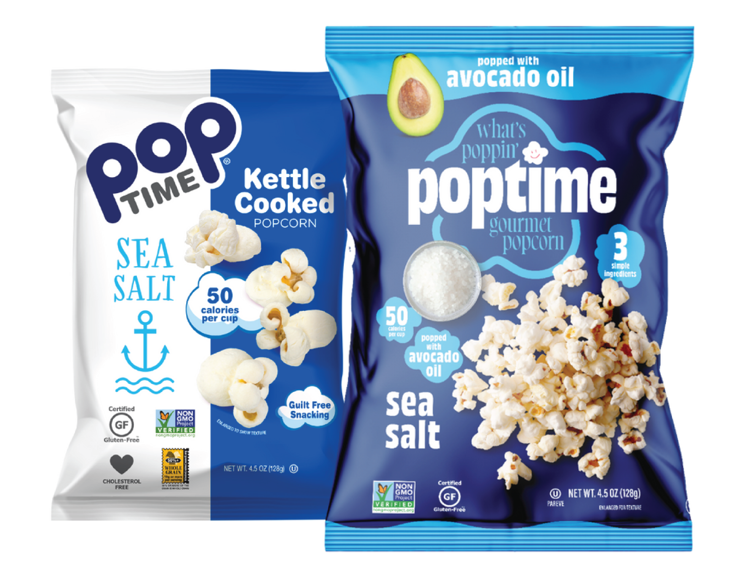
BEFORE
AFTER
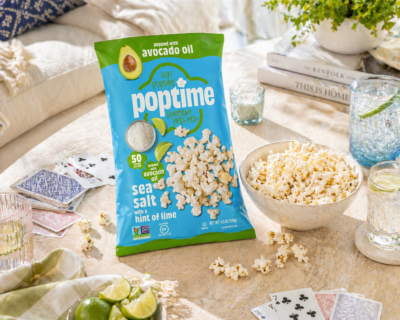
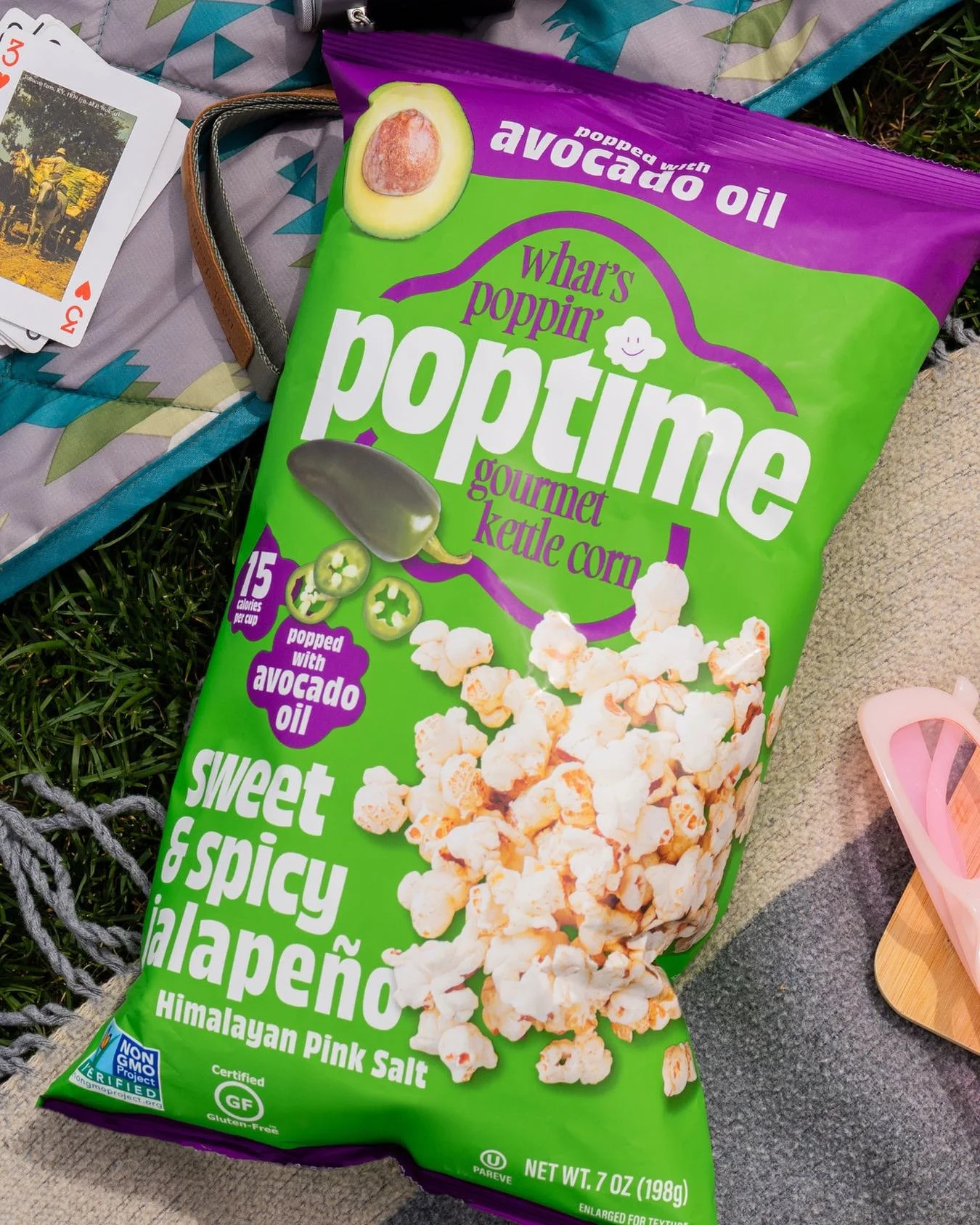
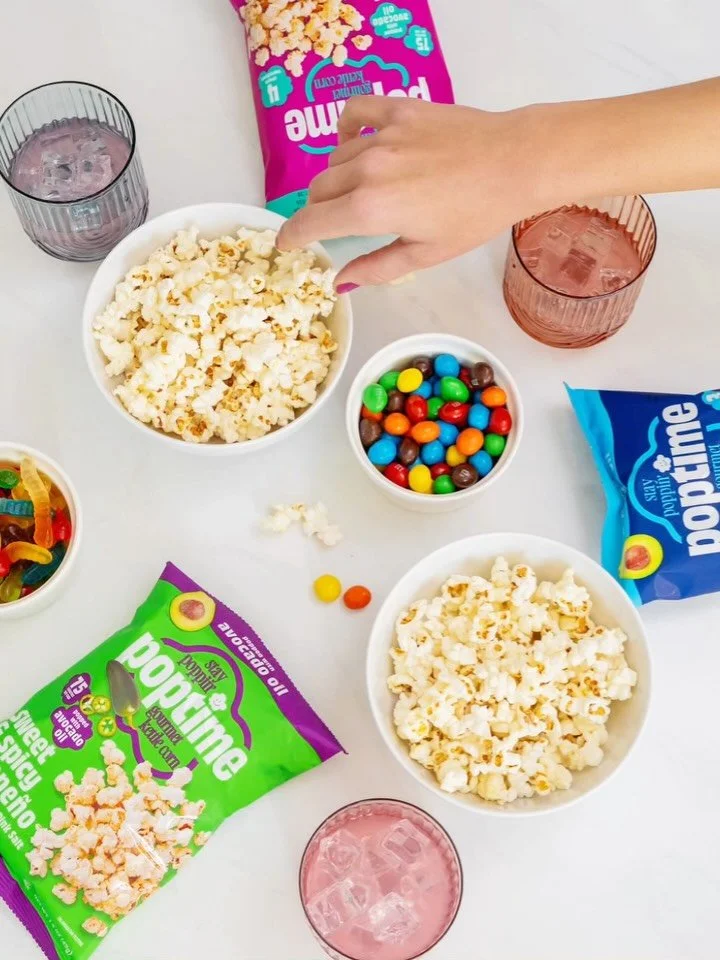
Poptime was growing quickly, but the brand presentation wasn’t keeping pace. The packaging had been outgrown, wasn’t standing out on shelf, and didn’t yet reflect a fully retail-ready brand. In a competitive snack category, it lacked the visual presence and clarity needed to capture attention and communicate value in seconds.
THE STARTING POINT
The product had a meaningful point of difference, but it wasn’t being communicated clearly or quickly enough. The packaging needed to work harder—both on shelf and online—where it serves as the primary selling tool. Without strong hierarchy and differentiation, the brand risked being overlooked by shoppers and under-communicating its value to retail buyers.
THE CHALLENGE
We developed a refined packaging and brand system designed to remove friction at the moment of decision. The focus was threefold: elevate retail readiness so the brand shows up with confidence and credibility; strengthen shelf presence through clearer hierarchy and more distinctive visuals; and clarify differentiation by making Poptime’s seed oil–free positioning immediately obvious. The result is a flexible, scalable system that improves communication across retail, buyer conversations, and e-commerce—positioning the brand for continued growth.
OUR APPROACH
“Buttermilk Creative helped us become a stand-out in the snack category as one of the only fully seed-free lines.”