Identity Design
Packaging System Design
Eureka Tortilla
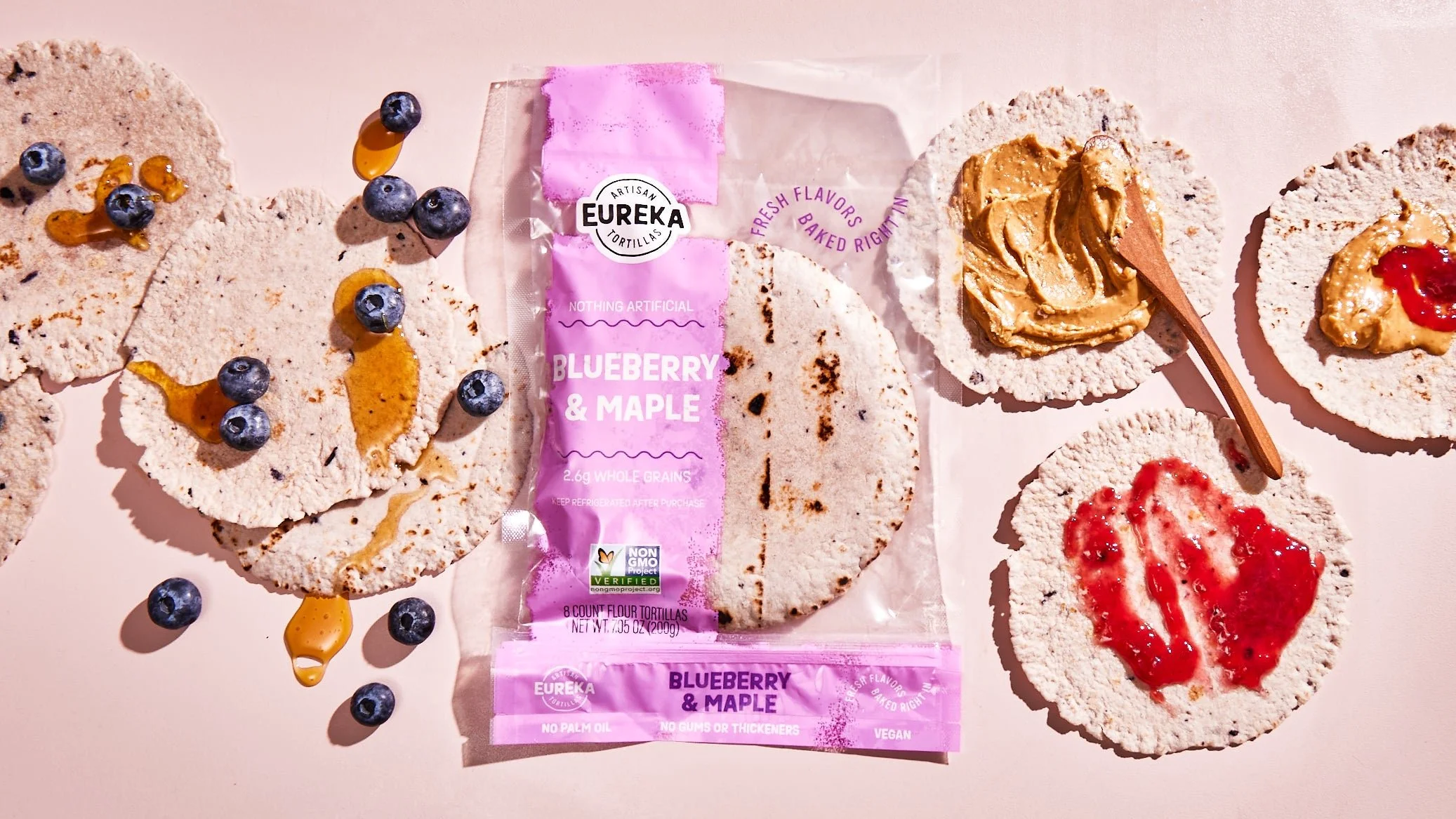
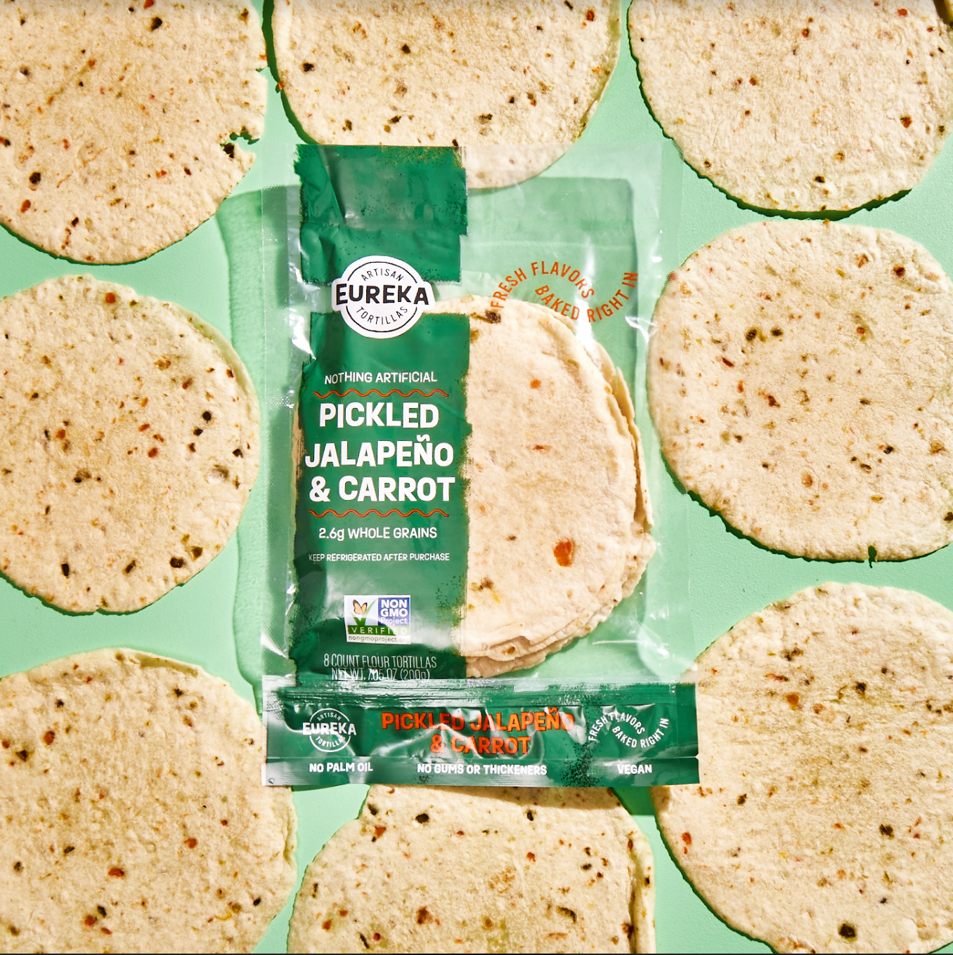
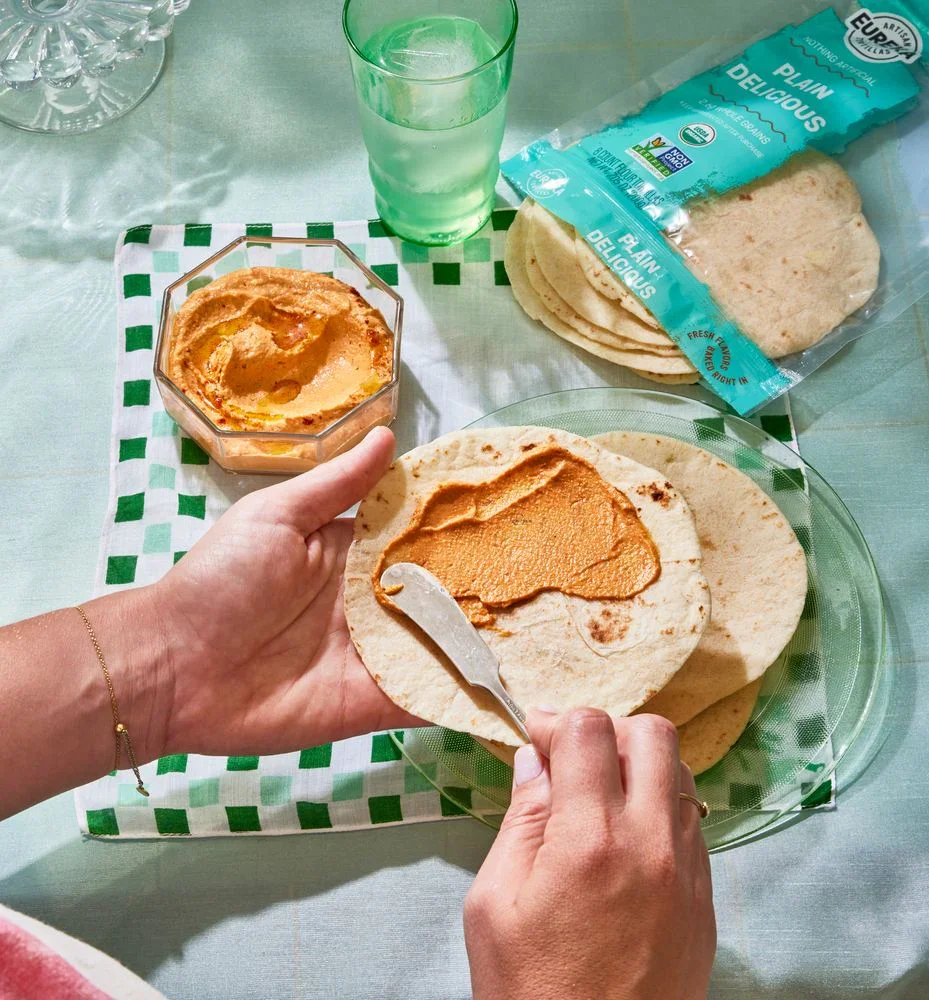
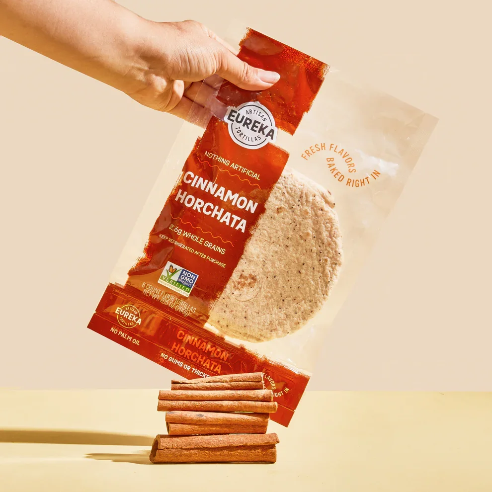
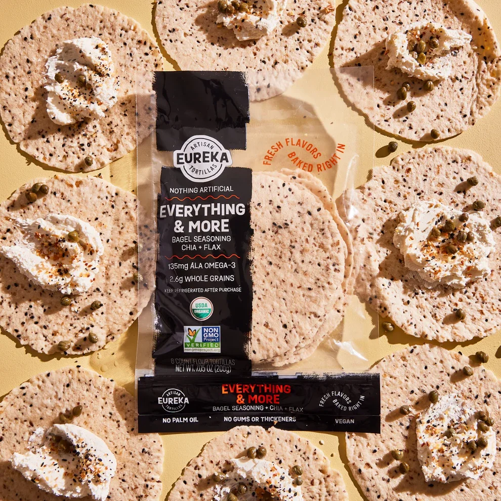
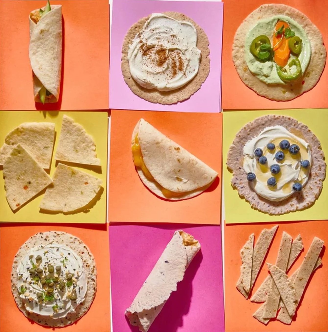
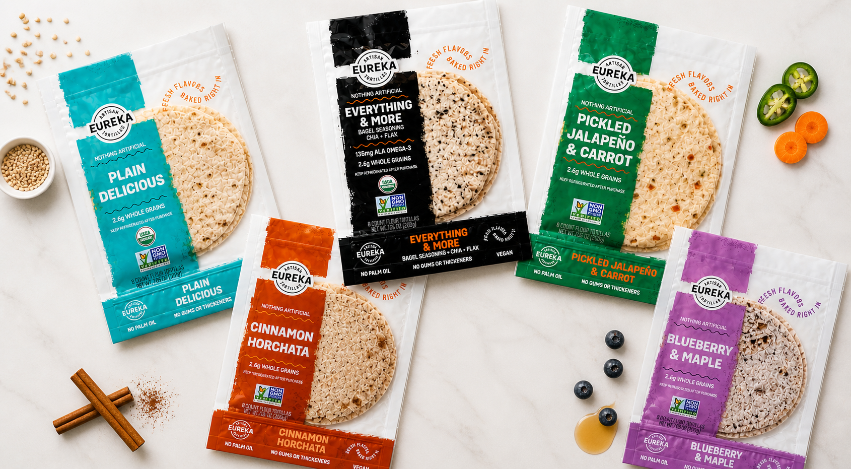
Eureka Tortilla approached Buttermilk Creative to refresh its packaging system and strengthen its presence at retail. We developed a bold, highly legible design that elevates brand recognition, clarifies product differentiation, and positions Eureka as a modern, flavor-forward brand in a traditionally conventional category.
-
As the brand prepared for retail expansion, the opportunity was to create a packaging system that could stand out on shelf while scaling across formats. Our approach focused on clarity and visibility—amplifying the Eureka name for immediate recognition and introducing a flexible “content band” to organize key information such as flavor cues and product claims. A vibrant, flavor-led color system helps shoppers quickly navigate the lineup, supported by expressive typography that reflects the brand’s energy and optimism.
Designed for flexible packaging formats, the system prioritizes bold, legible elements that maintain integrity across materials and environments. The result is a cohesive, contemporary identity that stands apart from category norms while remaining highly functional at shelf—positioning Eureka Tortilla as a confident, differentiated brand that brings flavor and personality to the forefront.