KIND
Healthy Grains Energy
Packaging System Design
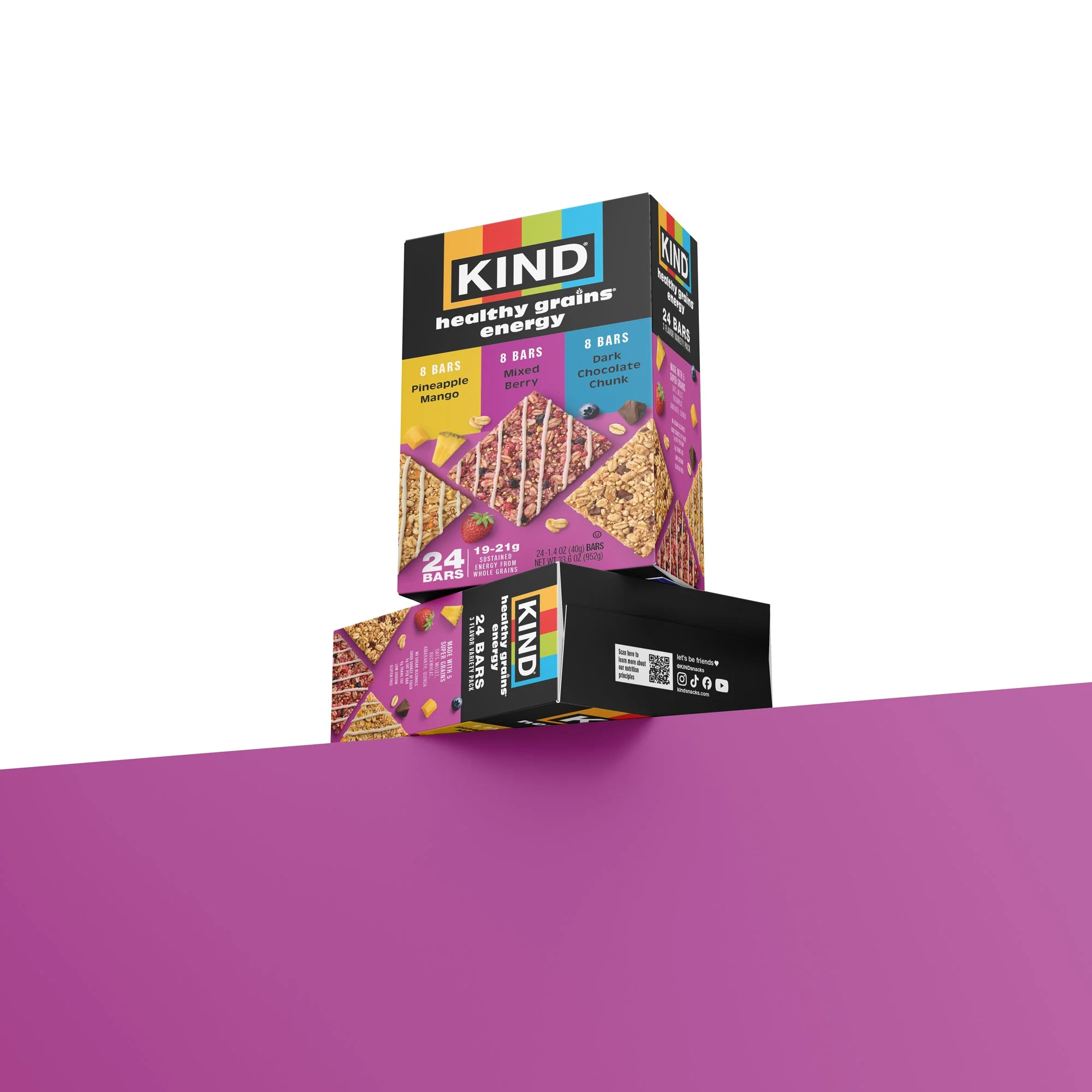
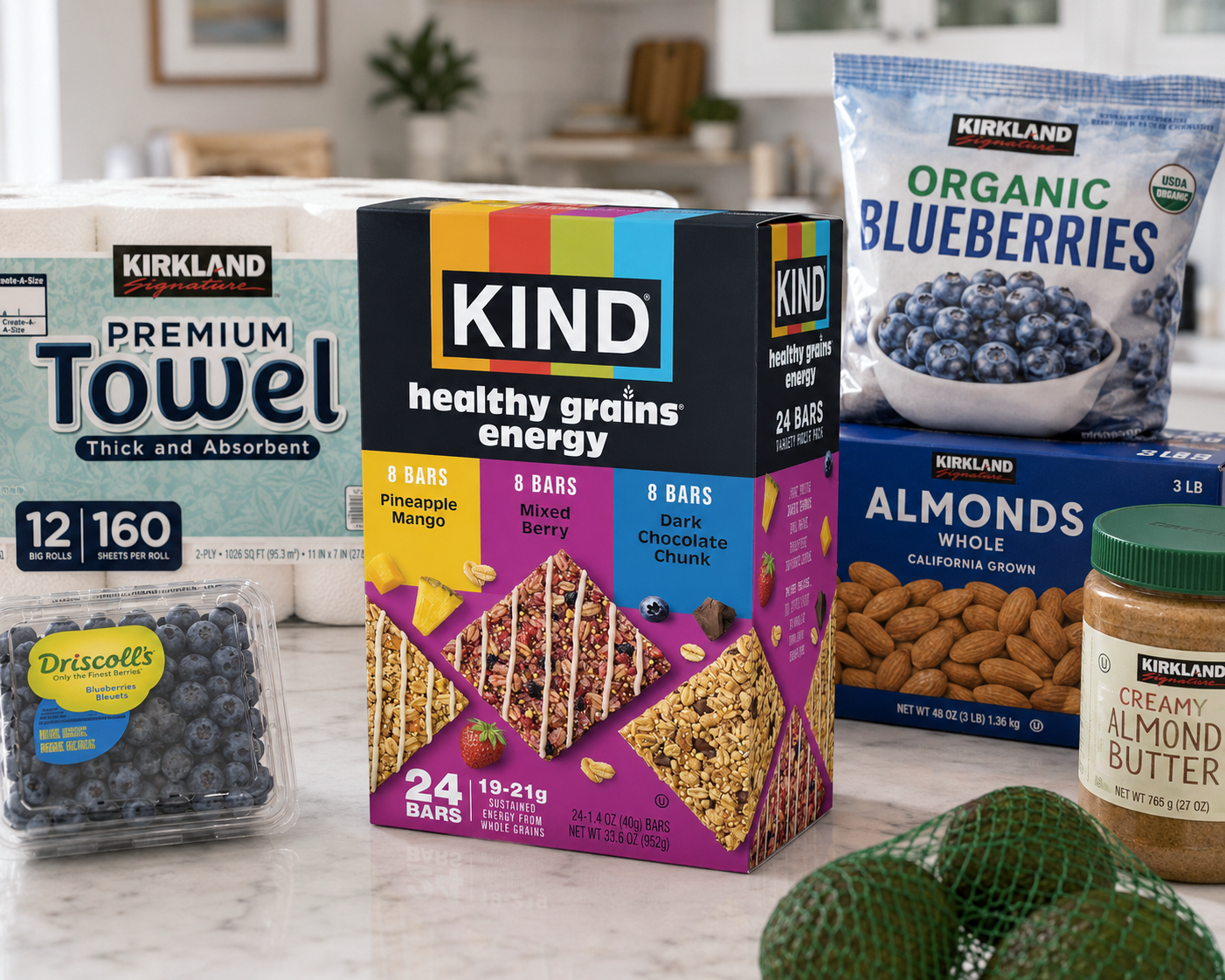
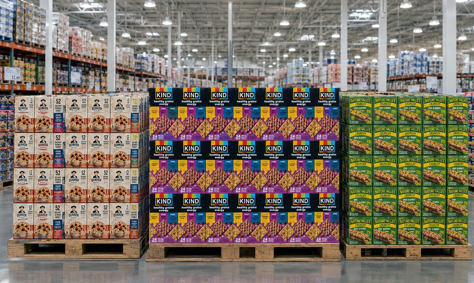
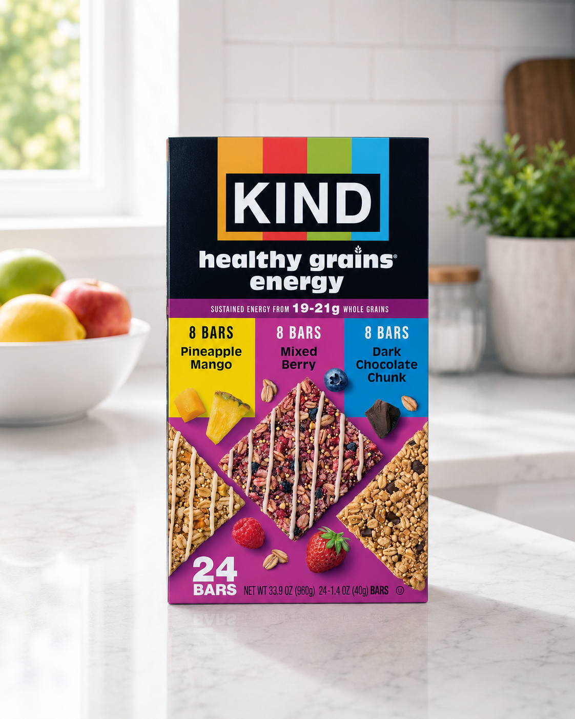
KIND partnered with Buttermilk Creative to develop Costco packaging for its Healthy Grains Energy line, translating a recently redesigned core brand system into a larger-format retail environment. The result is a cohesive, high-impact package that maintains brand consistency while optimizing for visibility and clarity at club scale.
-
Following an update to KIND’s core packaging, the opportunity was to extend the new visual system to a Costco-exclusive format. This required more than simple adaptation—the design needed to perform at a larger scale, communicate value quickly, and remain instantly recognizable within a high-volume retail setting. Our approach focused on preserving key brand elements while refining hierarchy, layout, and messaging to suit the unique demands of club retail.
We emphasized bold, legible typography, clear flavor segmentation, and strong product visualization to ensure the packaging stands out both in-store and online. By thoughtfully translating the updated identity into this format, we created a seamless extension of the KIND brand that reinforces familiarity while supporting performance in a new retail context.