Identity Design
Packaging System Design
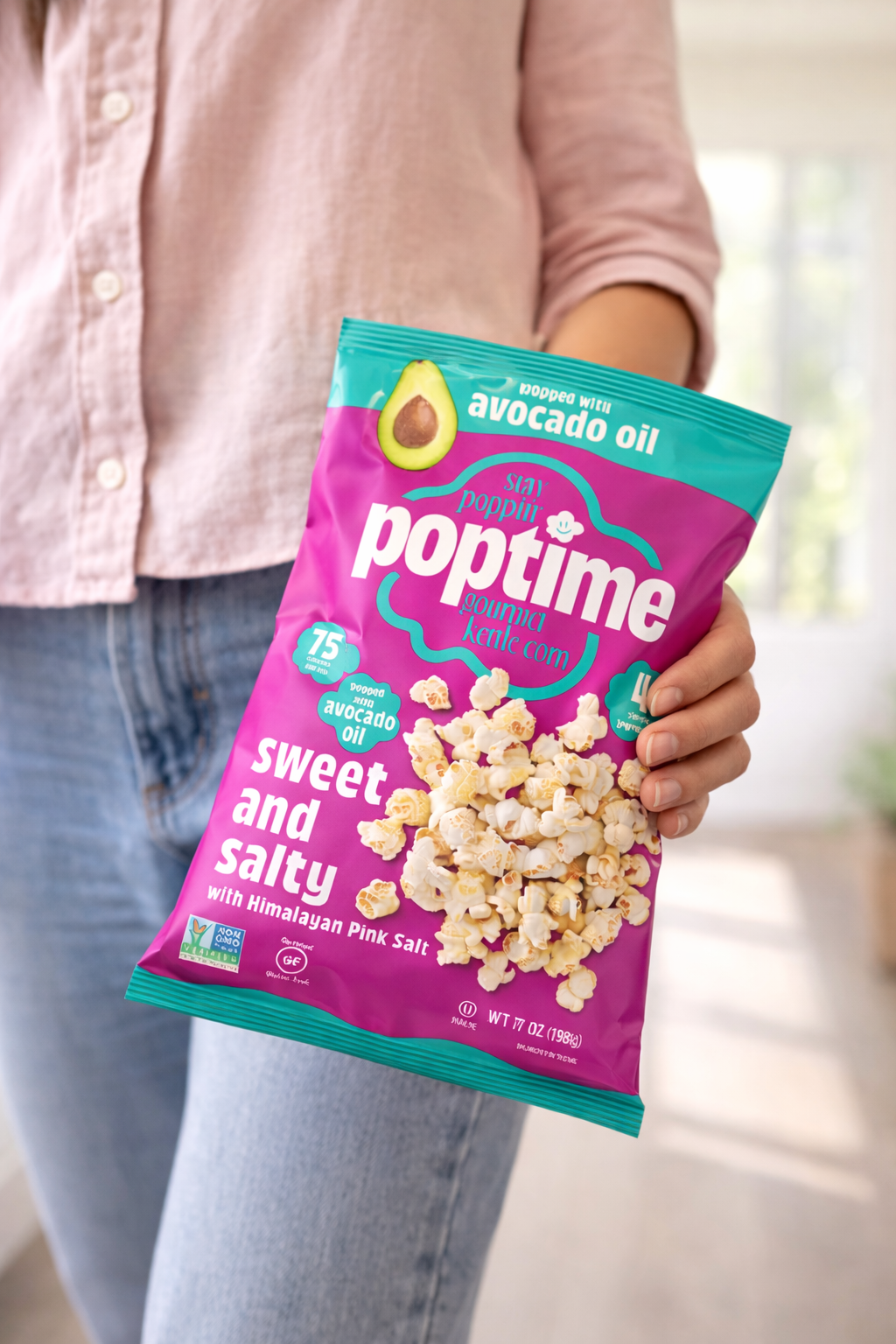
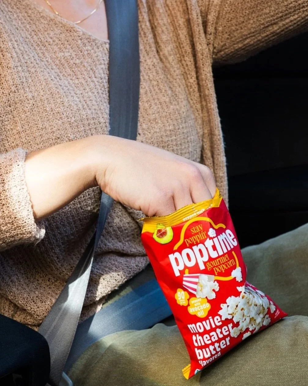
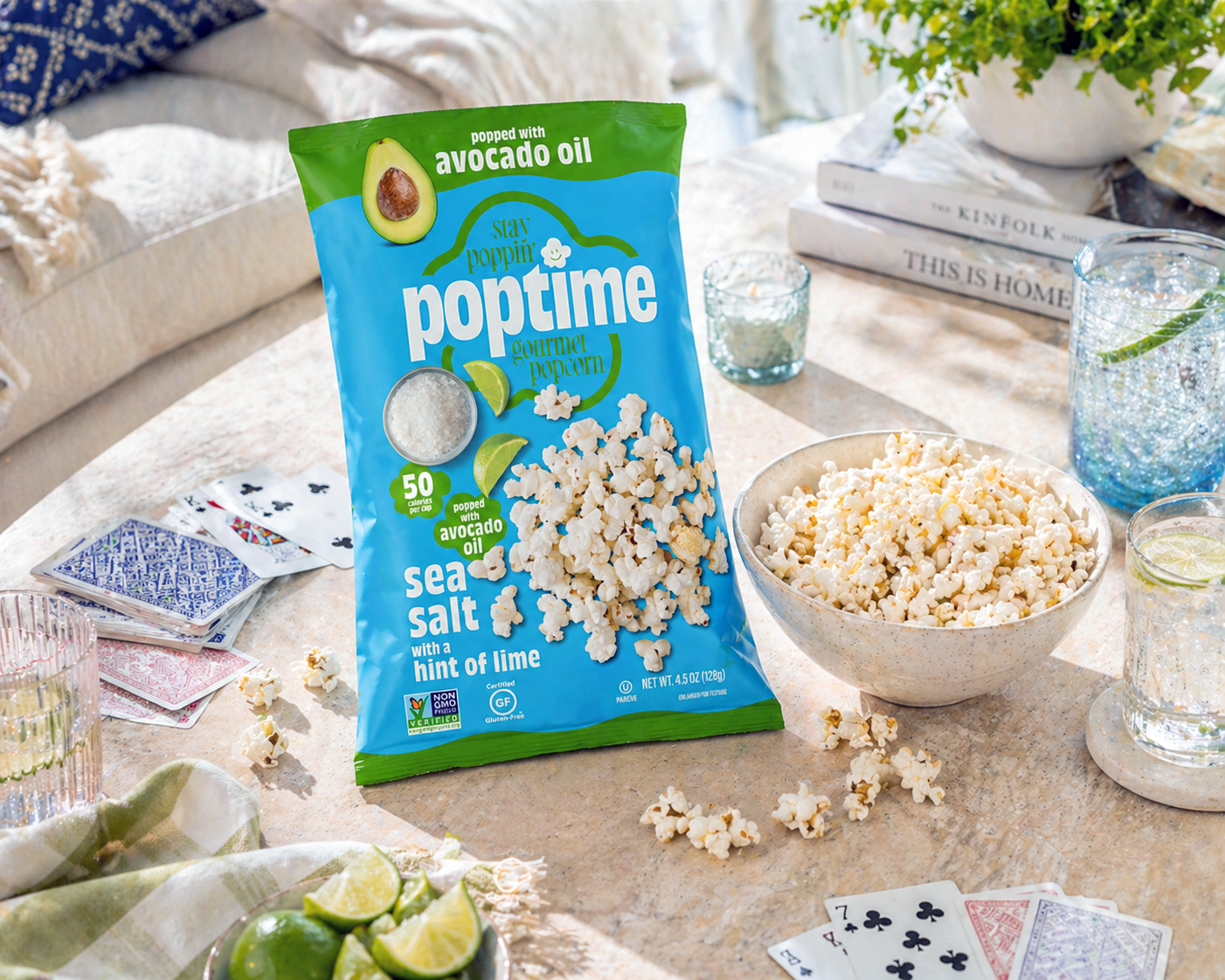
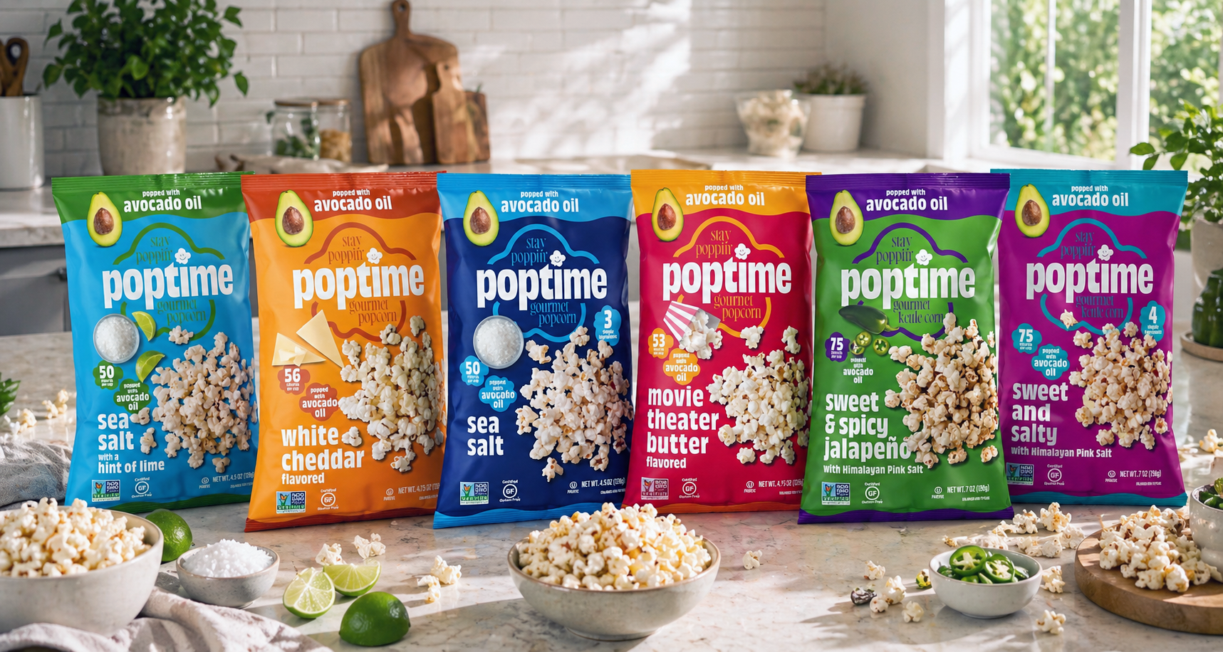
Poptime Snacks
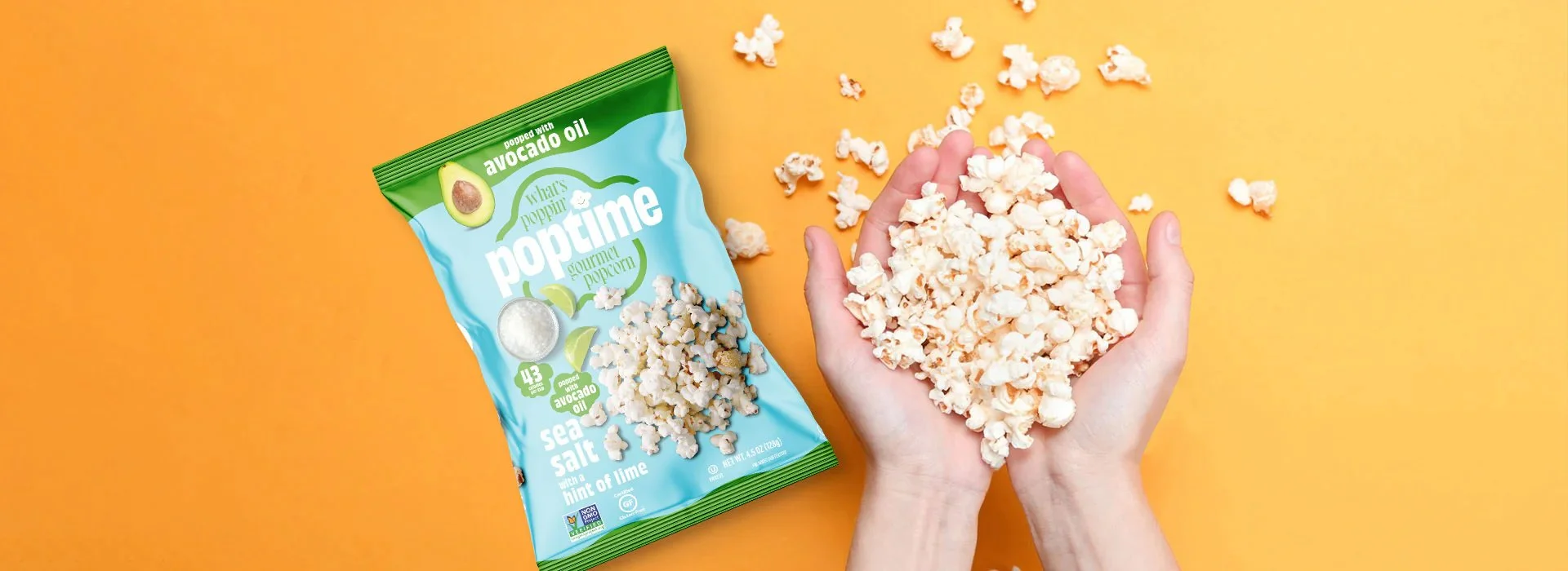
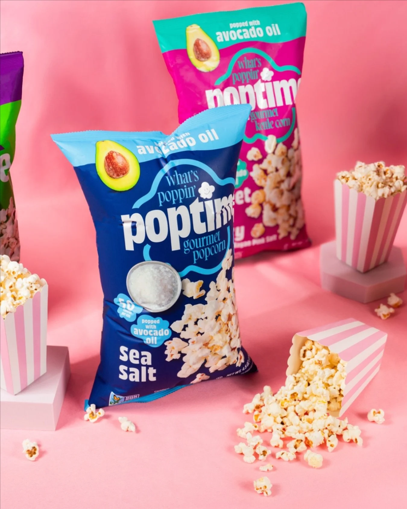
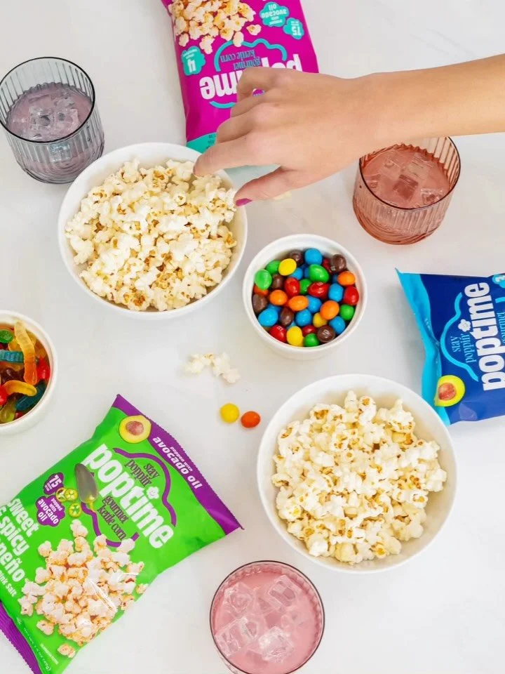
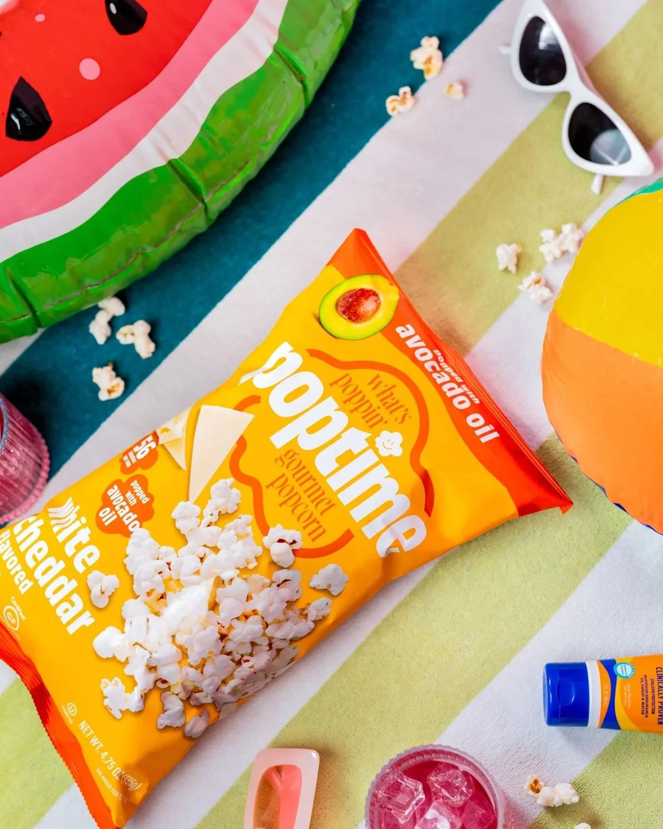
Poptime Popcorn evolved into a more confident, retail-ready brand through a refreshed identity and packaging system designed to better compete on shelf. We created a bold, scalable visual language that strengthens brand recognition, clarifies differentiation, and positions the product for continued growth across retail and e-commerce channels.
-
As the brand gained traction, its existing look no longer reflected the quality of the product or its potential in the market. The opportunity was to elevate the brand without losing its personality—creating a system that feels more polished, intentional, and ready for larger retail environments. Our approach focused on improving visual hierarchy, refining typography, and developing a more distinctive color and layout system that enhances shelf presence and makes key messaging easier to understand at a glance.
We also clarified the brand’s core point of difference—its seed oil–free positioning—ensuring it is communicated quickly and effectively across packaging and digital touchpoints. The result is a cohesive, flexible system that removes friction in the buying experience, supports stronger buyer conversations, and sets the foundation for future product extensions. The refreshed brand positions Poptime as a standout in the snack category, built to scale with confidence.