Identity Design
Packaging System Design
Yep! Shake
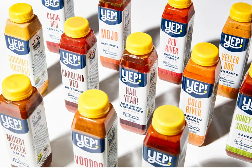
Yep! Shake partnered with Buttermilk Creative to redesign its logo and packaging system across a growing lineup of spices and sauces. What was once an inconsistent family of products tied loosely to the parent restaurant brand evolved into a cohesive, standalone identity with stronger shelf presence, clearer communication, and a scalable foundation for future retail growth.
-
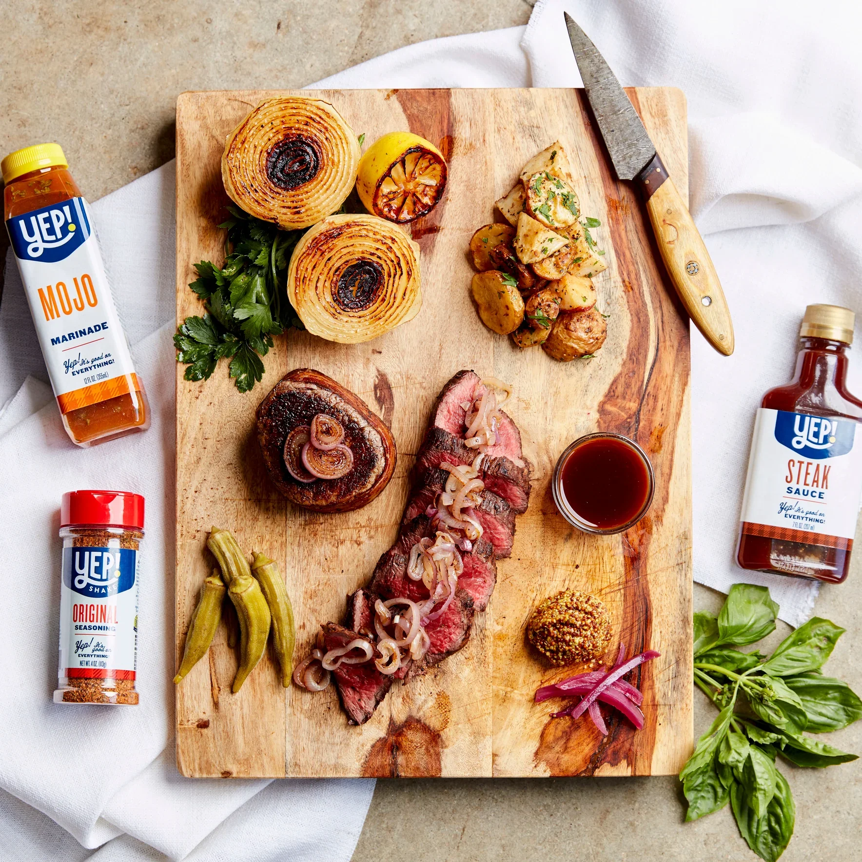
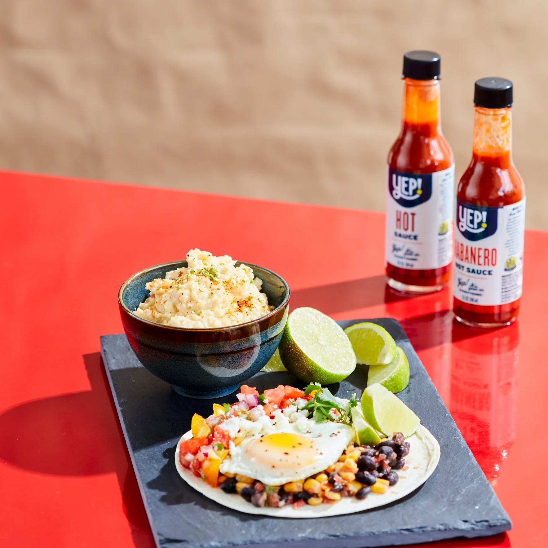
As the product assortment expanded, the existing packaging lacked consistency and made it difficult for shoppers to quickly understand the lineup. Our approach focused on streamlining the brand architecture by defining Yep! Shake as its own distinct consumer brand—separate from the restaurant and catering business where the products originated. We refined the logo, simplified the visual language, and developed a more organized packaging system with stronger hierarchy, clearer flavor differentiation, and improved navigation across SKUs. The result is a unified family that feels more polished, recognizable, and retail-ready.
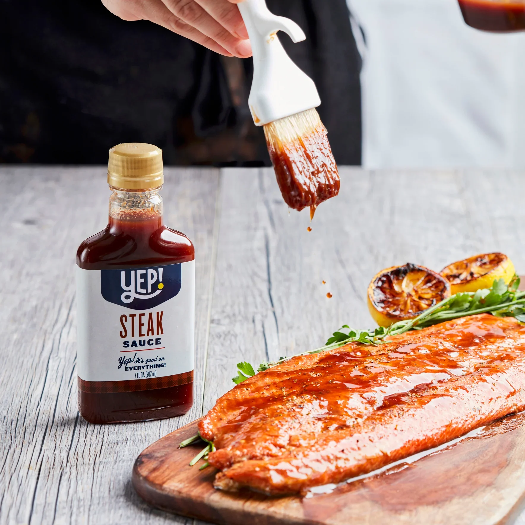
Beyond the front-of-pack refresh, we also restructured the back panel experience to improve both functionality and storytelling. Information was reorganized to create greater clarity around product usage, flavor profiles, and brand messaging, helping consumers better connect with the products while making the packaging easier to shop and understand. Designed to support future line extensions and expanded retail opportunities, the refreshed system positions Yep! Shake as a confident, scalable brand with a clear point of view and room to grow.