
Goodles, Barilla, and a box that was no accident
What the acquisition made me revisit about their packaging design
Barilla is buying Goodles, and I've really enjoyed the flood of posts about it.
I can't weigh in on the business side or the investor side of it. But it did make me go back and revisit, rethink, and appreciate their approach to design.
A stale category and a big blue box
When they started in 2020, they wanted to shake up a stale category. It was owned by the big blue box, and they were going to approach it differently. The formulation, the product mix, all of that, and they were also going to look nothing like anybody else on that shelf.
Check out this quick grid I built.
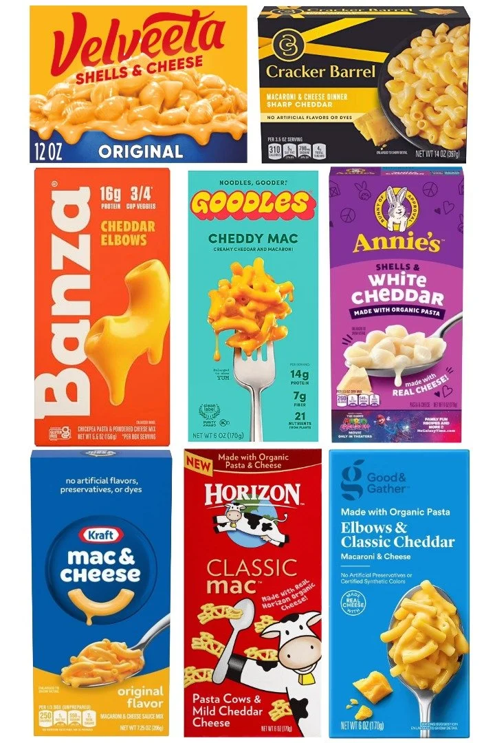
That wordmark
That wordmark. The yellowy orange against the teal is about as bold as it gets, and it's one of the loudest things in the lineup. Complementary colors, high contrast, big fat rounded type, and it just about vibrates off the box.
Then look at what's around it. One fork on a clean field instead of a bowl. Three claims in a tidy column with air around them. 14g protein. 7g fiber. 21 nutrients. Done.
That's discipline. They spent all of their volume in one place and then got out of the way.
Everybody else is talking at once
Everybody else in this grid is running badges, banners, starbursts and callouts all at once. It feels like everyone is just trying to do way too much on their packaging.
It's the visual version of trying to have a conversation in a loud restaurant.
The only box not wearing cheese
And Goodles is the only pack here not wearing cheese. Everybody else is yellow, orange, or primary blue, because that's what the category decided cheese looks like.
Goodles took teal for the field and put the cheese color where your eye actually lands. Which back then took some nerve.
I know blue is a dairy cue, and the big blue box is a classic legacy brand that got that way for a reason. But Goodles said maybe it isn't, and to show how different they were as a product and brand, they went against that category norm. Folks were attracted to that difference.
The cool thing is it was thoughtful and intentional. Sometimes you have brands that want to be different for different's sake, and that's not enough. It's gotta be woven into the culture.
It's a balance all emerging brands have to strike: go with the category norm or go against it.
Banza comes closest
The most recent iteration for Banza comes closest. Confident wordmark, clean claim block, real personality. But Banza is still head to toe in category orange, so the wordmark has to fight its own background.
Everyone else has so much to learn from Goodles.
You see brands emulating this look everywhere now, but back when they launched it was pretty revolutionary.
And it got folks' attention
80% of Goodles sales come from people who either weren't eating mac and cheese at all, or started buying more of it than before.
They ended up at 7.8% of shelf-stable mac and cheese, and profitable within four years, which is HUGE for a startup brand. When you look at this grid you can really see visually why they were so successful. And to think 92% of the country still hasn't tried them.
Design isn't the whole story. But it's part of it.
Plenty of folks are writing about how well the business was run and how great the founder and team is, and I agree with all of it. If design alone got brands acquired we wouldn't all be starving artists 😩
I just want to give the packaging its due. Great packaging makes a huge difference.
It might be my biased opinion 😁 but I think it definitely contributed to their success and getting acquired. That box was no accident.
Kudos to Studio Please, Dan Chodrow, and Zero Studios for all the creative work.
Sorry to contribute to the Goodles noise, but I had to!
